The 5 Best Shirt Colors for Custom Printing
The short answer
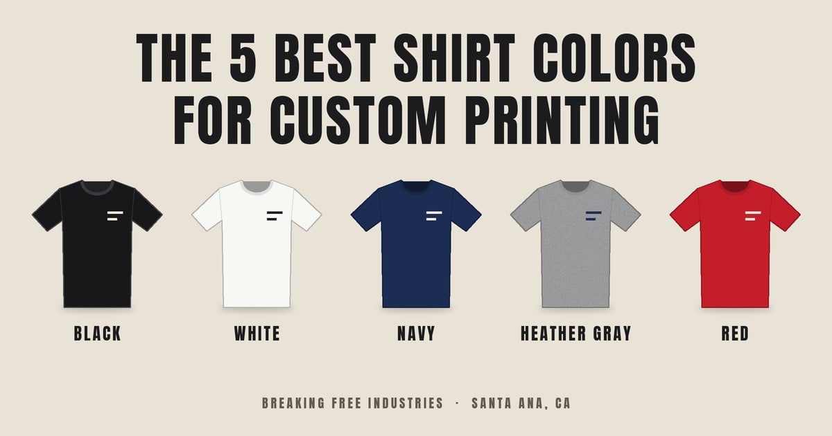
Black, white, navy, heather gray and red are the five shirt colors custom printers see most. Printful, Printify and ooshirts all list black, white and navy. Gray and red show up on two of the three lists.
- Black: the best base for light inks. It hides wear.
- White: the cheapest to print and the truest for full-color art.
- Navy: the dark shirt people actually wear to work.
- Heather gray: forgiving. It takes light and dark ink.
- Red: loud. White and black ink read best on it.
None of these sources publish sales counts. Read the order as a guide, not a ranking.
1. Black
Black is the default. White, neon and metallic inks give the strongest contrast on it, and it covers small production flaws (ooshirts). It also hides wear, so prints keep looking sharp after many washes.
Print note: light inks on black need a white underbase so the color reads true. Dark ink on black disappears. Skip it unless you want a tone-on-tone look.
Best for: work crews, event shirts, merch, anything that gets washed hard.
2. White
White is usually the cheapest shirt to print. Ink soaks into the fibers, and full-color or photo-style art shows its true colors with no underbase (ooshirts).
Print note: use dark inks. Light ink on white washes out, especially from a distance. White also shows sweat and dirt, so think twice for hard-working crews.
Best for: detailed artwork, photos, fundraisers, one-day events.
3. Navy
Navy looks professional and works with light inks. It hides wear and stains, and logos stand out on it (ooshirts, Printful).
Print note: navy is a dark shirt, so it needs the same white underbase as black. White, cream, gold and light blue ink read best. Dark ink sinks into it.
Best for: uniforms, staff shirts, school and restaurant teams.
4. Heather gray
Heather gray is the forgiving one. It sits in the middle, so it takes both light and dark inks. The textured fabric hides wear and tolerates small registration errors (ooshirts). Athletic heather is mostly cotton, 90/10 in the Bella+Canvas 3001, and it hides dampness (Printful).
Print note: the heather texture can show through thin ink, so fine detail looks softer. Heathers with more polyester can bleed dye into light inks. Ask your printer about low-bleed ink.
Best for: gyms, sports, casual everyday shirts.
5. Red
Red gets attention. White and black ink stand out on it (ooshirts), and Printful lists it with black, white, navy and gray as a long-running bestseller (Printful).
Print note: skip red-toned ink on a red shirt. White, black and cream read best. Red is a dark-to-mid shirt, so expect an underbase under light colors.
Best for: spirit wear, fundraisers, sports teams, event staff.
How to choose
Pick the shirt color from your artwork, not the other way around.
- Contrast first. Light ink goes on dark shirts. Dark ink goes on light shirts. Light ink on a light shirt is hard to read, especially from a distance (ooshirts).
- Know the underbase. Dark fabric pulls ink colors toward the garment dye. A white layer printed first fixes that (Printable Press).
- Expect a higher price on dark shirts. The underbase adds a screen, a setup step and a flash cure, and that cost usually lands on the dark-shirt quote.
- Keep ink away from the shirt color. A green logo on a kelly green shirt blends in.
- Test before you order. View the same art on three or four shirt colors first.
FAQ
What shirt color is cheapest to print?
White and other light colors. They skip the white underbase that dark shirts need.
Which shirt color hides wear best?
Black, navy and heather gray. All three hide stains and fading better than white.
What ink colors work on a black shirt?
White, neon and metallic inks give the strongest contrast. Dark inks disappear on black.
Why does a dark shirt cost more to print?
The printer lays down a white underbase first so colors read true. That adds a screen, a setup step and a flash cure.
How many shirt colors should I test?
Three or four. Compare the same artwork on each before you place the order.
Not sure which color fits your design?
Send us the artwork. We’ll mock it up on a few shirt colors so you can see the difference before you commit.
Breaking Free Industries is a screen printing and embroidery shop in Santa Ana, CA. We’re a second-chance employer. People with conviction histories do the work on your order.