Beyond Black and White: Seasonal Color Palettes for Custom Apparel
Choosing colors for custom apparel can feel like a small design decision, but it shapes how a shirt, hoodie, or event piece comes together. Seasonal color palettes offer a practical starting point: they give a business team, school, club, or event committee a shared visual direction without requiring everyone to be a designer.
Think of a palette as a set of colors that work together, not a rulebook tied to a calendar. You can use these combinations for a spring fundraiser, a summer camp shirt, fall staff apparel, or winter merch. The goal is to choose colors that suit the occasion, make your artwork easy to read, and feel right for the people who will wear them.
Spring palettes: light, fresh, and easygoing
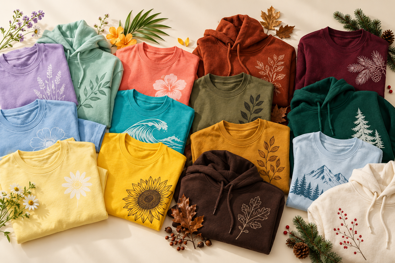
Spring color ideas often begin with softer shades and a lighter overall feel. Pair sage green with cream and dusty blue for a calm, outdoorsy look. For a brighter option, try lavender with pale yellow and white. Blush pink, warm beige, and muted green can also create a gentle palette for a school club, community event, or small business team.
If your design includes a logo, decide which color should lead and keep the others in supporting roles. For example, a navy logo can stay prominent against a pale garment, while sage and cream appear in smaller graphic details. A restrained palette can feel more coordinated than using every seasonal shade at once.
Summer palettes: bright, clear, and energetic
Summer events often call for colors that are easy to spot outdoors and feel lively in group photos. Cobalt blue with white and a small coral accent gives artwork a crisp, energetic direction. Teal with sand and sunny yellow feels more relaxed, while red, royal blue, and white can create a familiar team-oriented combination.
For a company picnic, tournament, or summer program, consider how the palette will look across a crowd. A strong base color with one or two accents helps different elements—such as event names, team labels, or sponsor marks—stay organized. If the design uses several bright colors, give them room rather than crowding them into one small area.
Fall palettes: rich, warm, and grounded
Fall color palettes tend to draw from deeper, warmer tones. Rust, deep navy, and cream make a useful pairing for a harvest event or seasonal retail collection. Forest green with mustard and charcoal feels outdoorsy and bold. Burgundy, heather gray, and warm tan can bring a more understated look to school groups, staff apparel, or club merch.
When using darker colors, plan for contrast. A light-colored design may stand out clearly on a deep base, while dark lettering can disappear against a similarly dark garment. Test the artwork colors together at the size they will actually appear, especially for small text and detailed logos.
Winter palettes: classic, cool, and celebratory
Winter does not have to mean only black, white, or holiday red and green. Cranberry with heather gray and cream offers a seasonal combination that can work beyond a specific holiday. Deep green with navy and a soft neutral feels more understated. Ice blue, charcoal, and white create a cool palette for winter events, school groups, or team travel.
For a holiday gathering or year-end event, a single metallic-looking accent in the artwork can suggest a special occasion, but keep the overall design legible. The garment color, ink or thread colors, and the amount of detail all affect the finished look, so discuss the art and decoration plan together before finalizing.
How to choose a palette for your group
Start with the purpose of the apparel. A staff uniform may need to feel consistent with an organization’s existing identity, while a one-day event shirt can lean more playful. Schools and clubs may already have colors to include; treat those as the anchor, then add a seasonal accent or neutral rather than replacing the identity people recognize.
Next, narrow the choices. Pick one main color, one supporting color, and—if the design needs it—one accent. Consider where the artwork will sit and whether the lettering, logo, and garment will have enough contrast. If you are choosing among garment colors, confirm which options are actually available for the style and quantity you have in mind before making a final commitment.
A simple digital mockup can help a group compare directions, but it is only a guide: screen colors may not match the finished garment or decoration exactly. When color is especially important, ask about reviewing a sample or other production proof before moving ahead.
Bring your seasonal color idea together
The most useful seasonal apparel color palettes are the ones that fit your organization, artwork, and wearers—not just the season. Start with a clear purpose, choose a few complementary colors, and check contrast before the design is finalized. That approach gives businesses, schools, clubs, and event organizers a practical path from a broad color idea to a coordinated custom apparel design.
Have a palette in mind for your next project? Email josh@breakingfreeindustries.com with your group, event, and design direction to start a conversation about custom apparel.